Register now or log in to join your professional community.

These days it's rare to see anyone using HTML elements for tables other than the basic TABLE, TR and TD. This of course makes it much more difficult to apply styles to the table and even more difficult for web spiders and people using screen readers to make sense of the contents.
1. Proper HTML TABLE Markup
To make an HTML table easier to format and more accessible we can make use of extra tags as shown in the example below:
<table class="t1" summary="Top downloaded movies in using BitTorrent, in descending order, listing number of downloads and worldwide cinema grosses"> <caption>Most Downloaded Movies on BitTorrent,</caption> <thead> <tr><th>Rank</th><th>Movie</th><th>Downloads</th><th>Grosses</th></tr> </thead> <tfoot> <tr><th colspan="4">torrentfreak.com</th></tr> </tfoot> <tbody> <tr><th>1</th><td>Fast Five</td><td>9,,</td><td>$,,</td></tr> <tr><th>2</th><td>The Hangover II</td><td>8,,</td><td>$,,</td></tr> <tr><th>3</th><td>Thor</td><td>8,,</td><td>$,,</td></tr> <tr><th>4</th><td>Source Code</td><td>7,,</td><td>$,,</td></tr> <tr><th>5</th><td>I Am Number Four</td><td>7,,</td><td>$,,</td></tr> <tr><th>6</th><td>Sucker Punch</td><td>7,,</td><td>$,,</td></tr> <tr><th>7</th><td> Hours</td><td>6,,</td><td>$,,</td></tr> <tr><th>8</th><td>Rango</td><td>6,,</td><td>$,,</td></tr> <tr><th>9</th><td>The King’s Speech</td><td>6,,</td><td>$,,</td></tr> <tr><th></th><td>Harry Potter and the Deathly Hallows Part2</td><td>6,,</td><td> $1,,,</td></tr> </tbody> </table>
From the top you will see that there is only one class assigned to the TABLE itself and none to individual rows or cells. All of the formatting is applied based on the class (.t1) using CSS as described below.
The summary attribute of the TABLE is only for screen readers. It gives clues to the user as to what to expect in the table. The caption tag content does appear on the page and can be used to format a heading associated with the table. The caption text can display either above or below the table.
2. Sections of the TABLE
The contents of the TABLE are divided into three distinct sections - THEAD for the heading, TFOOT for the footer and TBODY for the content (or data). Interestingly we can place the footer content before the table data, but still have it display at the bottom of the table.
This helps not just in applying formatting to the table, but also allows for advanced printing and browsing options for long tables - having the header/footer repeat on each printed page for example, or making the table contents scrollable. More on that later.
The rest of the markup is a combination of TH for the header row and column and TD for the rest.
3. CSS styles to format the TABLE
Now comes the fun part of applying styles. Most of it is fairly simple and straight-forward, apart from a couple of instances where we use the nth-child pseudo-class to target formatting to specific rows and cells:
<style type="text/css"> table.t1 { margin:1em auto; border-collapse: collapse; font-family: Arial, Helvetica, sans-serif; } .t1 th, .t1 td { padding:4px8px; } .t1 thead th { background: #4fbd; text-transform: lowercase; text-align: left; font-size:px; color: #fff; } .t1 tr { border-right:1px solid #b3d7; } .t1 tbody tr { border-bottom:1px solid #b3d7; } .t1 tbody tr:nth-child(odd) { background: #dbe5f0; } .t1 tbody th, .t1 tbody tr:nth-child(even) td { border-right:1px solid #b3d7; } .t1 tfoot th { background: #4fbd; text-align: left; font-weight: normal; font-size:px; color: #fff; } .t1 tr *:nth-child(3), .t1 tr *:nth-child(4) { text-align: right; } </style>
One important step is to set the border-collapse property of the TABLE to collapse. This allows us to apply borders to rows and cells without them doubling up or otherwise looking strange.
4. The end result
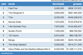
By now you'll be curious how this actually looks in the web browser. With all the formatting applied we end up with the following:
Most Downloaded Movies on BitTorrent,rankmoviedownloadsgrossestorrentfreak.com1Fast Five9,,$,,The Hangover II8,,$,,Thor8,,$,,Source Code7,,$,,I Am Number Four7,,$,,Sucker Punch7,,$,, Hours6,,$,,Rango6,,$,,The King’s Speech6,,$,,0Harry Potter and the Deathly Hallows Part,,$1,,,
Note that you can now apply this class to any properly marked up data table and the same formatting will be applied. The only data-specific formatting we've used is to right-align columns3 and4 and that can be easily removed. Otherwise it doesn't matter how many rows or columns are present.
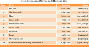
As a demonstration of this the links below the table (1,2) let you toggle between two different formats. All we are doing is using JavaScript to change the class of the TABLE from .t1 to .t2 and let the CSS rules do the rest.
The rules for the second, orange, formatting are as follows:
<style type="text/css"> table.t2 { width:%; border-collapse: collapse; font-family: Georgia; } .t2 caption { padding-bottom:0.5em; font-weight: bold; font-size:px; } .t2 th, .t2 td { padding:4px8px; border:2px solid #fff; background: #fbd7b4; } .t2 thead th { padding:2px8px; background: #f6; text-align: left; font-weight: normal; font-size:px; color: #fff; } .t2 tbody tr:nth-child(odd) *:nth-child(even), .t2 tbody tr:nth-child(even) *:nth-child(odd) { background: #f3eddd; } .t2 tfoot th { padding:2px8px; background: #f6; text-align: left; font-weight: normal; font-size:px; color: #fff; } .t2 tr *:nth-child(3), .t2 tr *:nth-child(4) { text-align: right; } </style>
For anyone using a very old browser, here are some screenshots:


Again, the TABLE markup is identical in each case, only the CSS changes.
5. References


