Register now or log in to join your professional community.
For accountants and finance personnel.

With Excel 2016, you can analyze different types of data from all sorts of different sources, and for many different reasons. In this article, you learn how to use the built-in My Cashflow template in Excel 2016 to manage the money you earn, how much you spend, and where your spending occurs.
Using the My Cashflow templateThe My Cashflow template is a simple example of how Excel 2016 and analyze, model, and present data to you interesting and insightful ways. The template is a great way to become familiar with the data analysis capabilities of Excel 2016, and to demonstrate how the built-in templates in Excel can make data analysis easy.
In this article, you learn how to do the following with Excel 2016:
Perform data modeling, using the built-in modeling capabilities of Excel.
Put some of Excel's time intelligence functionality to work.
Learn how the My Cashflow template was created, using powerful calculations called Measures that you can use in your workbooks as well.
To open the My Cashflow template, select New > Business analysis feature tour.
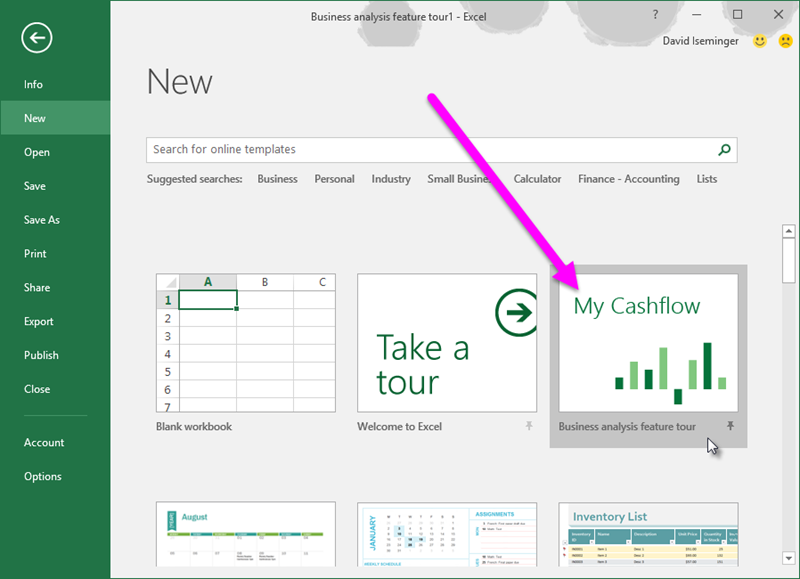
If you can't see the template, use the search box and type business analysis feature tour, and then select the magnifying glass button to begin the search (or click the Enter key). The My Cashflow template appears.
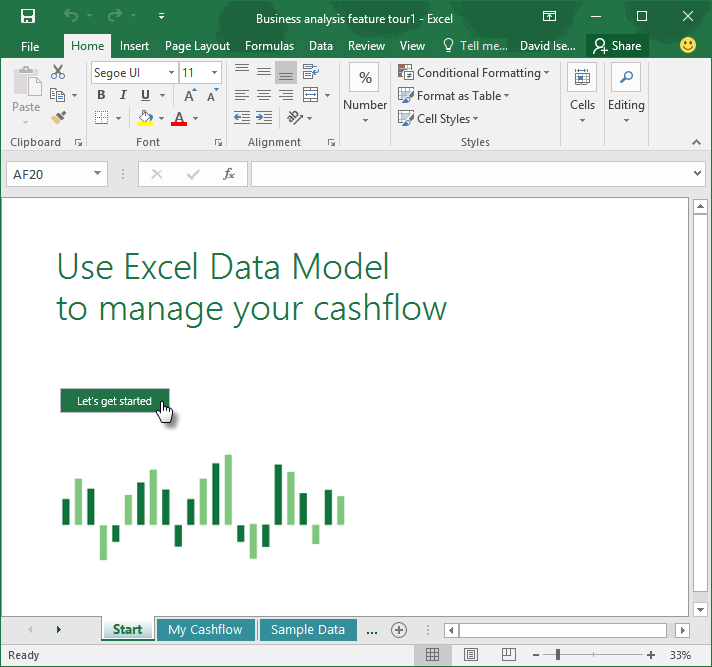
Once the template is open, you see the first workbook tab, titled Start. Select the Lets' get started button to begin.
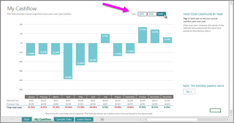
The My Cashflow workbook tab is selected, showing you the cashflow report for the selected year. This cashflow graph displays a year-over-year cashflow comparison of the current year (selected by the buttons in the upper right corner of the workbook) and the previous year. This is considered a time intelligence calculation. You can select a different year using the buttons in the upper right corner of the worksheet. Notice how the bar graph changes when you select a different year.
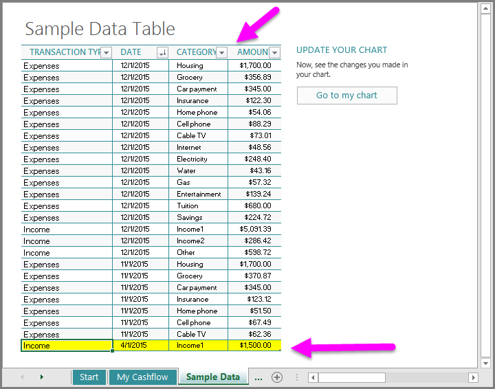
It's interesting to see the sample data that was included with the template, but it's much more interesting with your own data. To enter your own numbers - whether real numbers, or just experimenting with the template to get a feel for how it works - select the Sample Data worksheet tab. Notice the TRY IT instructions, to the right of the table, that provide guidance and a button to enter your own sample data.
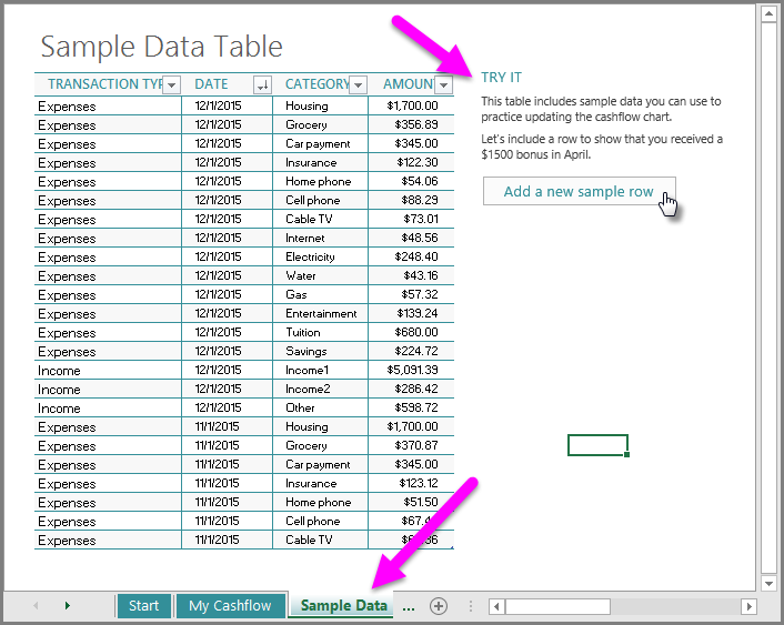
Once you select Add a new sample row, the template highlights a new row at the bottom of the table, and fills in the four columns with the following information:
Transaction Type - this first column is either Income or Expense. By using only those two categories, the graph on the My Cashflow worksheet can consistently compare income to expenses. In this example the bonus is Income.
Date - this is the date of the transaction. The template automatically inserts 4/1/2015, but you can apply whichever data you choose. The graph in the My Cashflow sheet groups income and expenses by month and year, based on the value in this column.
Category - this column lets you categorize your income and expenses. There are quite a few categories already included, which you can choose from. You can also create a new category, especially if you expect to get lots of bonus checks, which is always nice. You can view income and expenses by category too, so entering information into this category consistently will help ensure any subsequent analysis goes smoothly.
Amount - this is the amount of the income or expense. You enter positive numbers into this column (rather than using negative numbers for expenses, for example), because the calculations associated with the data model knows how to properly handle income and expenses, based on positive numbers in this column.
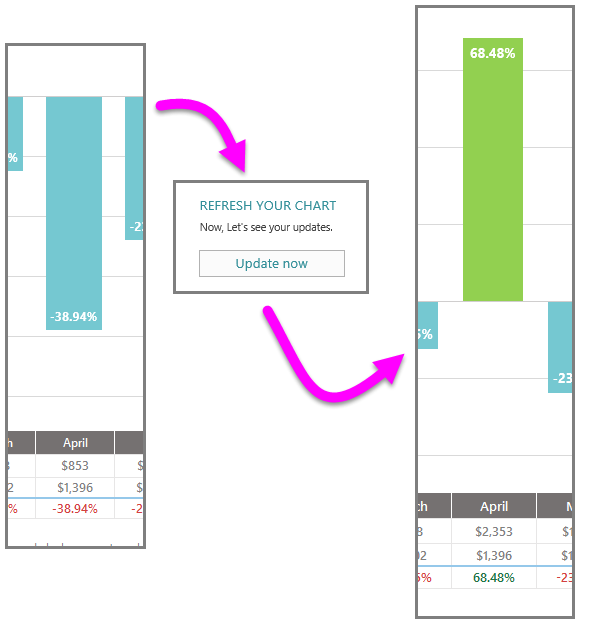
Once the data is entered, and we go back to the chart and select the Update now button (which refreshes the data model), we can see the changes reflected in the cashflow chart. With the additional $1500 income we added in theTRY IT instructions, the month of April went from being down 38.94% compared to the previous year, to being up 68.48% over the previous year.
 Using the Excel Data Model
By completing the previous steps to enter additional sample data into the My Cashflow workbook, you've just interacted with the Excel data model. A data model is an organized collection of data elements that relate to one another in a structured, or standardized, way. In the My Cashflow data model, there are many data elements (the cashflow entries) that relate to one another by the four structured, or standardized, categories (Transaction Type, Data, Category, Amount).
Data models can be simple like this My Cashflow data model, or complex like a database or a collection of databases that are organized to relate to one another in specific ways. Data models do not have to be permanent or created solely by database engineers; data models can be created on-the-fly in Excel from various sources, to suit your own data analysis needs.
You can also analyze a data model by looking at portions of that data in particular ways, such as through graphs or other visualizations. For example, you might want to analyze only expenses for your cashflow, and only for the 2015 calendar year. By doing so, you're looking at (analyzing) a subset of the data model that meets your criteria, and gaining insights from what you see. Just like data models, visualizations and data analysis can be simple (such as: a graph of how much I spent on my Internet bill in 2015) or complex.
Enable Data Analysis add-insExcel 2016 includes a powerful data modeling feature called Power Pivot. To enable Power Pivot and other data analysis add-ins, select File > Options to bring up the Excel Options window. Select Advanced from the left pane, then scroll down to the Data section, which is near the bottom of the scrolled window. At the bottom of the Data section, there's an option to Enable Data Analysis add-ins: Power Pivot, Power View, and Power Map.
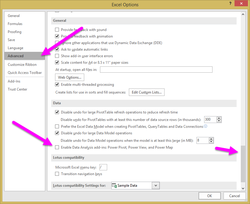
Select the checkbox, and then select OK.
When the data analysis add-ins are enabled, the Manage Data Model button appears in the Data Tools section of the Data ribbon. When we select the Manage Data Model button, the Power Pivot data modeling window appears.
 Using Time Intelligence in Excel 2016 with Measures
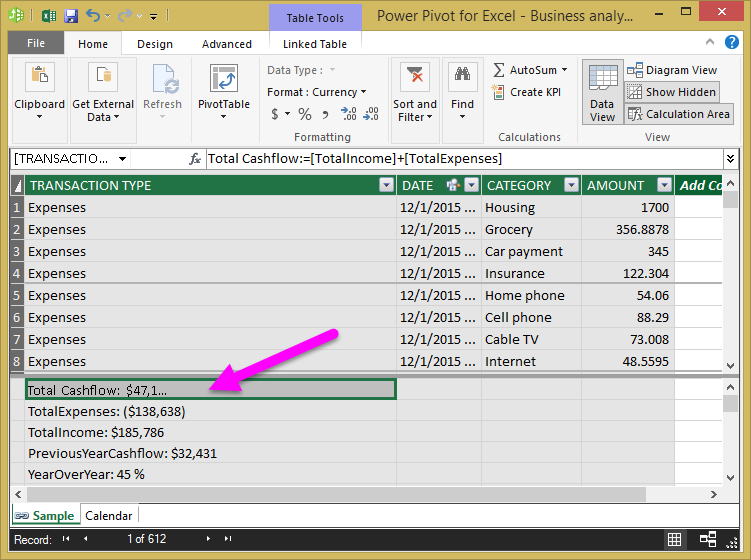
The My Cashflow template uses a few of the time intelligence capabilities of Excel 2016, such as the year-over-year comparison demonstrated earlier in this article. These time intelligence capabilities were implemented as Measuresthat were created in the data model in the template. To see these Measures, select the Manage Data Model button in the Data tab to show the Power Pivot window. The first measure is called Total Cashflow.

good tip..... i also haven't used MS excel 2016... but appreciate your effort for these useful tips... (y)
Thanks for the invite, I apologize for the answer, I leave the answer to the specialists.

thanks for the invitation
Question and answer wonderful professors Ghada

thanks for invitation sorry i dont have any idea about excel 2016 .......................

I Agree with your answer Mrs, Ghada

Nice info Mrs Ghada Eweda
it's really useful

Thanks for the invitation, I agree with M's Ghada answers.

great answers by Ghada Eweda, i agree with her...

thank you for sharing this....i have not yet tried excel 2016


